Charts And Graphs Learn Excel 365
Charts And Graphs: Learn Excel 365
Published 9/2025
MP4 | Video: h264, 1920x1080 | Audio: AAC, 44.1 KHz
Language: English | Size: 512.34 MB | Duration: 0h 59m
Transform data into clear, engaging visuals in Excel 365 with professional chart creation and customization skills.
What you'll learn
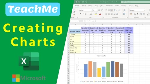
Select data and insert different chart types in Excel.
Modify chart elements (titles, labels, colors, legends).
Utilize formulas to link chart titles to cell data.
Distinguish between area charts and other chart types.
Create and rotate surface charts for data visualization.
Use radar charts to compare multiple data points.
Plot three variables on a bubble chart in Excel.
Import stock data and create candlestick charts.
Optimize chart aesthetics for compelling data storytelling.
Enhance charts with illustrations, arrows, and text boxes.
Analyze trends and patterns within the area and candlestick charts.
Adjust axis scales, titles, and data labels for clarity.
Requirements
Basic Excel knowledge
Access to Microsoft Excel 365
Basic computer skills
A computer with internet access
Description
This course includes downloadable course instructor and exercise files to work with and follow along.Charts and Graphs: Learn Excel 365 shows you how to transform raw data into clear, engaging visuals that tell a story. Whether you work with large datasets or prepare simple reports, this learning experience will help you create charts that make your information easy to understand and visually appealing.You will start by exploring Excel 365's interface, focusing on the 'Insert' tab, where all chart types are found. You'll learn to select relevant data, exclude unnecessary totals, and choose from Excel's recommended charts for the best starting point. You'll use the Chart Design and Format tabs from there to customize layouts, adjust colors and labels, and switch chart types for the clearest presentation.As you progress, you'll discover advanced techniques to enhance your data storytelling. This includes adding graphics, text boxes, and icons to emphasize key insights and linking chart titles to worksheet data so they update automatically when your data changes.You'll also work with specialized chart types such as area, radar, bubble, surface, and candlestick stock charts. Step-by-step exercises will guide you in adjusting axes, refining aesthetics, and improving readability to create professional-quality visuals.By the end, you will have the skills to present data accurately, visually engagingly, and easily for any audience to understand, allowing you to make stronger, data-driven presentations and reports.This course includes:59 minutes of video tutorials12 individual video lecturesCourse and Exercise Files to follow alongCertificate of completion
Students who need to present research findings, projects, or assignments with visuals that stand out.,Business professionals who prepare reports, dashboards, or presentations for colleagues and stakeholders.,Data analysts and researchers who need to communicate trends and patterns effectively.,Finance and accounting staff who want to enhance financial reports with compelling visuals.,Small business owners and entrepreneurs who use data to make informed decisions and communicate insights.,Beginner to intermediate Excel users who want to expand their skills beyond basic spreadsheets into professional charting and data visualization.
https://rapidgator.net/file/a19163a4a99906aa72b5106f3faa5486/Charts_and_Graphs_Learn_Excel_365.rar.html

Information
Users of Guests are not allowed to comment this publication.